Front page picture
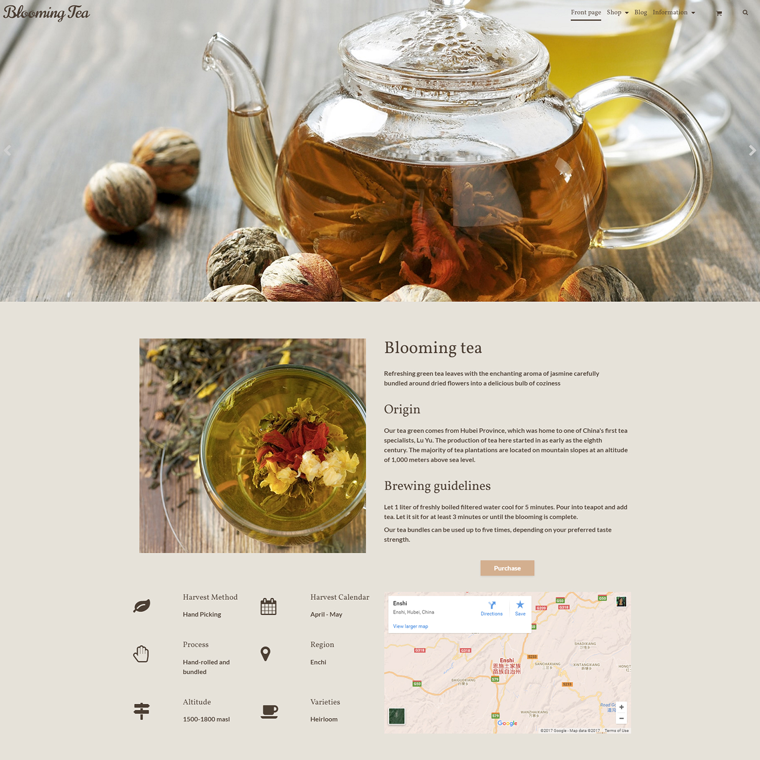
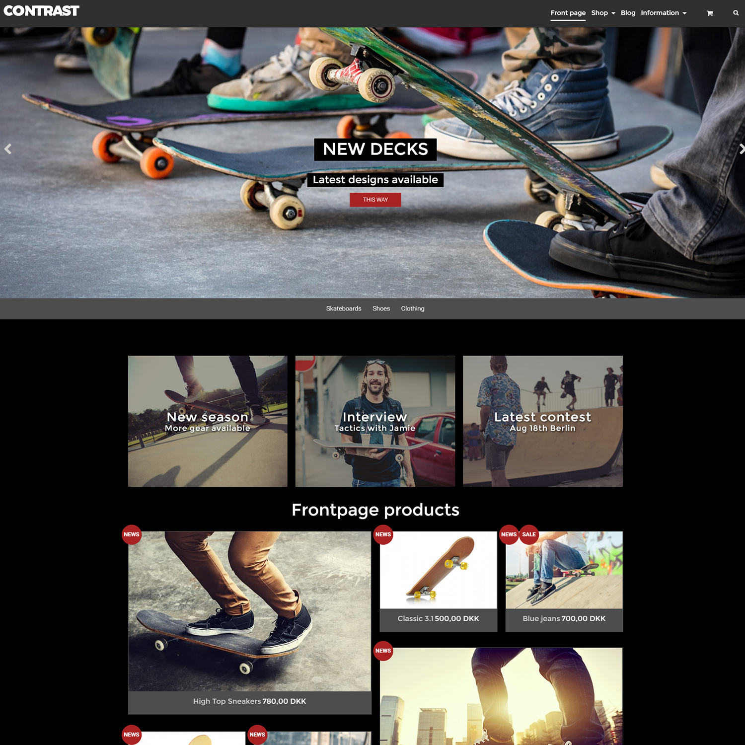
The big picture element is located on the front page, underneath the navigation bar. An element like this could be a way to catch your visitor’s attention by showing off your brand, communicate your values to your visitors (eg. “100% organic and cruelty free skincare products”), announce a new sale and feature a product.
What kind of picture to choose?
When choosing the image, think about what would represent your shop the best possible way, since this will help set the mood of your website and will make it more memorable for the visitors, which means they will be more likely to return. A hero image should be a high-resolution photo or graphic that is wider than it is high. See the exact image resolution recommendation for Terrarium below.
Readable text
If you plan to add some text on top of your pictures we would recommend that you keep close attention to the contrast. If your text will be white on top of the picture, add a darker overlay on top of the picture to ensure that your message remains readable.
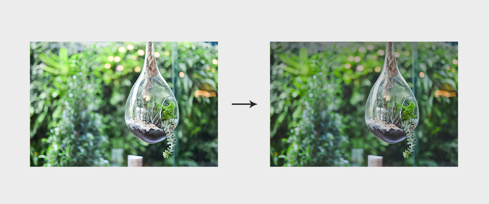
Darken pictures for more contrast
Cropping
Crop your images so that the most meaningful detail is in the center. Most of our templates automatically crop the hero images on smaller screens to keep the image from stretching and losing clarity.
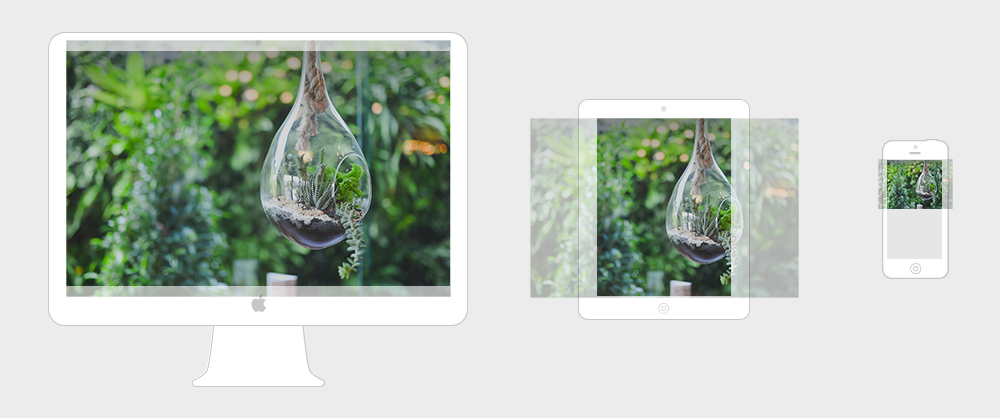
Automatic cropping
Picture slider
If you decide to use multiple images and create a picture slider or carousel, we have some recommendations that you should keep in mind:
- Keep a consistent style across your hero images.
- Keep the number of pictures used to a minimum.
- Only feature images that add value to your page in some way. If the slider’s only purpose is decoration, you should reconsider adding it.
- Keep the overlaying headline, text and call-to-action short and concise.
Picture size
To take advantage of the template’s full potential when it comes to visuals, you should make sure to upload high quality pictures. In case of the picture element of the front page, we recommend that you use optimised images with dimensions of 1860X1046 at 72dpi.
To optimise the image, use Optimizilla lossy compression tool which helps significantly reduce the file’s size while maintaining the image’s quality. Simply upload the image, change the quality settings if needed and press download.
In order to display a big picture element with two headlines and a call to action button go to your front page in the Page tree and select Picture element. Upload a new picture or choose an existing one from your file manager and press Save. Your picture should be showing in the panel.
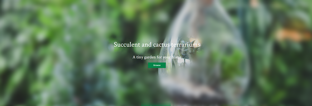
Use a value proposition and a call to action button
Add content
Go to Extra info in order to add headlines and call to action button. Enter a Link where you want to button to lead, a Title which will serve as the main headline, a Description which will be displayed as a secondary headline and a Link text, which will be the button’s text. You must enter something in the Title field, otherwise the other elements won’t be shown.
You can customise this section’s height by going to the Design Manager, choosing a value from the dropdown of the Frontpage picture height value setting and saving your changes. Choose between the values of 35%, 40%, 50%, 60%, 70% and 100% which represent the amount of space the image will take up of the front page's above the fold area. The positioning of the headlines and button will change to match the section’s new height.
Tip: Enter just an empty space into the Title field if you don’t want to show the main headline.
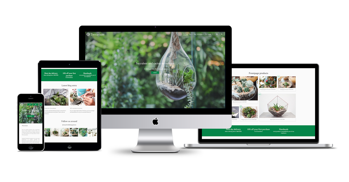





Social media feed
The social media section of the template can be used to insert content from your social media feed. In the following example we will walk you through how to insert an Instagram widget that will display the latest posted pictures.
Instagram feed using SnapWidget
Step 1 - Create a new page
To get started, create a new page in the page tree. Choose a Title and a Heading for the page which will be shown as the section’s main headline and subtitle. Set the page to be hidden in the menu, since we will only use this page to store the widget.
Step 2 - Select a tool
In order to create an Instagram widget, we have to use a third party tool. For this tutorial, we chose Snapwidget, because it is easy to use and it provides many options to customise the design of the widget.
Tip: You can do some research about other available tools like Snapwidget by searching for “social media widget” in your web browser. Experiment with them to find out which tool suits your needs the best.
Step 3 - Create the widget
To get started, go to https://snapwidget.com and scroll down a bit until you see the headline Embed your photos and videos with a list of different options. We are looking for a FREE tool, that would create a responsive GRID of INSTAGRAM pictures, so we are going to choose the first item from the list.
A new window will open containing a preview of our widget and the different options to set up and customise it. To start customising first enter your Instagram username, accept the terms of Snapwidget that show up in the popup. At this point you should see the preview of the widget change and show pictures from the account you have just entered. The next few steps will be about customising the layout and design of the widget. To see how your widget will look with the created changes, press the Preview button to refresh.
Change thumbnail size - this means the size of the displayed images (Example: enter 200 which will make the pictures’ default size be 200 pixels in width and height)
Layout - the layout of the picture grid (We chose 6X1 for the widget visible in the Terrarium template. This will arrange six pictures organised into one row.)
Photo border - adds a border to each picture
Background color - adds a background color to your widget (you have to enter a valid hex color - same as in the Design manager)
Photo padding - adds some spacing between the photos (we entered 10 to add 10 pixel gaps)
Hover effect - choose the effect that will show when you hover over a photo (we chose fade in because it matches the template’s image hover effects)
Sharing buttons - social sharing buttons will appear on hover - users will be able to easily share the images on their social media
Responsive - this will make the pictures scale nicely according to the browser window’s width (we recommend you choose yes)
Once you have made your changes press preview one last time to see how your widget will look. If you find it needs some more tweaking take your time, but if you are happy with the result, you can press the get widget button. An overlay window will show up on the screen containing the code that will generate the widget you just created. Press the Copy to clipboard button to copy the entire code snippet.
Step 4 - Add the widget
Once you have copied your widget’s code, open the new page’s Page content, change the content mode to Source and paste the snippet into the content area. When you switch back from Source mode to regular text mode, you will be able to see that your page’s content will be displayed as an iframe.
Inserted widget code
The page's content is an iframe, your widget
Step 5 - Display the widget
To display the widget on the front page we need to reference the page’s ID. Go to the Page data and find the Page ID field. Copy the number showing next to it and go to Online Store > Design. Press Customize at your copy of the Terrarium template, find the Social media page content (page ID) field and paste the number in the field next to it. After saving your changes you should be able to see the Instagram widget created earlier on the front page of your website.
Tip: Experiment with implementing other social media widgets like Pinterest or Twitter, the implementation process will be very similar to the one we described above.
Page ID